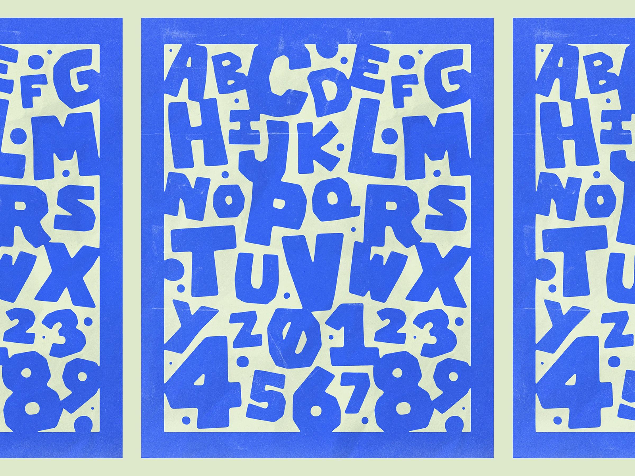
The Iconoclastic Design Abecedary: From A to Z, Unfiltered
Forget the polished and sanitized articles about design. Here's an abecedary that tells it like it is. From A to Z, without concessions and without bullsh*t. An impertinent little guide that reminds you of the fundamentals and makes you smile (sometimes wryly).
A for Alignment
Alignment is like punctuation. Invisible when done well, horribly visible when neglected. Good design aligns to a grid, not "approximately" or "it depends." If your eye detects something's off by 2 pixels, you're not being obsessive the designer was negligent.
B for Brand
No, not just your logo slapped on a business card. Brand is the invisible force that transforms fuzzy concepts like "values" and "emotions" into something you can actually experience. It's everywhere, not just in your precious style guide that nobody reads. A good brand makes you feel something without saying a word. A bad one screams without being heard. If you think branding is just the designer's job, you're already losing the game.
C for Contrast
Contrast is what makes your design either read or ignored. It's not an option, it's an obligation. Low contrast is like whispering in a nightclub nobody hears anything and nobody cares. And no, using light gray on slightly-less-light gray isn't contrast. It's laziness.
D for Details
The devil is in the details, but that's also where excellence resides. A misplaced pixel, an inconsistent drop shadow, an icon not quite aligned so many little negligences that transform exceptional design into mediocrity. If you're not ready to fight for a detail, change careers.
E for Experience
A beautiful interface that doesn't work is like a Ferrari without an engine: impressive in photos, useless in practice. User experience isn't what remains when you've finished making things pretty. It's the very reason design exists. Period.
F for Feedback
Instant feedback is the difference between a user who understands what's happening and one who clicks frantically wondering if your site is broken. A button that doesn't visually react when hovered over is like someone who doesn't look at you when you're talking to them. Irritating and slightly insulting.
G for Grid
The grid is the invisible skeleton of your design. Without it, your creation is just an amorphous mass of elements scattered like after an explosion. Mastering the grid is like mastering musical notation for a musician: it's non-negotiable, even if no one directly sees it.
H for Hierarchy
Visual hierarchy is guiding the user's eye exactly where you want it to go. Without clear hierarchy, the user wanders aimlessly through your interface like a lost tourist without GPS. And guess what? Lost tourists eventually go home.
I for Iteration
Believing your first version is perfect is like thinking your first kiss was a performance for the ages. Spoiler: it wasn't. Design is a process of constant iteration. Test, adjust, repeat. Masterpieces aren't born from a stroke of genius, but from a thousand small corrections.
J for Justification
The justification of text is like minimalist design applied without expertise: appealing in theory, often problematic in practice. Justified text creates "rivers of white" that run through your paragraphs like unsightly veins. Unless you're an experienced typographer with manual control over hyphenation, it's best to avoid it.
K for Kerning
Kerning is the spacing between letters. Poorly done, it transforms your carefully crafted text into a visual disaster. Bad kerning is like having a protruding tooth in a family photo—once you've noticed it, you can't see anything else.
L for Legibility
The illegible but "so original" typography is like a sports car that's impossible to drive: a magnificent failure. Legibility trumps everything. If your audience has to squint or zoom to decipher your message, you've failed, no matter how "disruptive" your typographic choice is.
M for Moodboard
The moodboard is the treasure map before beginning the adventure. Without it, you wander aimlessly, following momentary inspiration like a weathervane. Never underestimate the power of a good moodboard and I'm not talking about an "Inspiration" folder with 500 unsorted images on your computer.
N for Navigation
Good navigation is like a good restaurant waiter: present when needed, discreet the rest of the time. Bad navigation is like a labyrinth without Ariadne's thread. If your users have to think to find their way, you've already lost.
O for Originality
Originality at all costs is the trap beginners fall into. Real talent is knowing when to innovate and when to respect conventions. Reinventing the wheel for a navigation menu isn't creative genius it's misplaced egocentrism.
P for Prototype
A prototype is worth a thousand meetings. Stop debating for hours about how "users might react" and test a prototype. The real feedback from a disoriented user is worth all the theoretical arguments in the world.
Q for Questions
Good questions are more valuable than ready-made answers. "Does it work?", "Is it consistent?", "Does it really solve the problem?" ask yourself these brutally honest questions before your client does.
R for Responsive
In 2025, a design that isn't responsive isn't design it's an archaeological relic. A site that displays poorly on mobile is like a restaurant without toilets: it might be beautiful, but the experience will always be incomplete and uncomfortable.
S for Simplicity
Simplicity isn't the absence of complexity, but its perfect mastery. Making things simple is infinitely harder than making them complicated. Any beginner can create a dashboard overloaded with options only a master can reduce it to the essentials without losing functionality.
T for Typography
Typography is to your design what voice is to a singer: the fundamental tool. Poorly chosen typography ruins a design like a false voice ruins a song, regardless of the quality of the lyrics. And no, having 15 different fonts on one page is not a typographic strategy it's a cry for help.
U for User
The user is not a theoretical abstraction, nor a statistic in your analytics. It's a real person, probably tired, certainly in a hurry, and who couldn't care less about your creative ego. They just want it to work. Everything else is secondary.
V for Validation
Validation by ego is the ultimate designer's trap. Just because you find your creation brilliant doesn't mean it is. A design that pleases you but doesn't solve the problem at hand is like a delicious-tasting medicine that cures nothing: a pleasant but useless distraction. Test and validate with real users. Your portfolio will recover.
W for Wireframe
The wireframe is like the blueprint before building a house. Yes, it's less sexy than photorealistic 3D, but skipping this step is like starting to decorate a house before checking if the foundations are solid. Some mistakes are expensive to correct once the structure is completed.
X for XML
Yes, we're cheating a bit on this one. But XML (and its cousin SVG) reminds us that a modern designer must understand, at least superficially, the technologies that underpin their work. No, you don't need to become a developer but if you don't know what an SVG is in 2025, it's like being a photographer without knowing what an ISO is.
Y for "Y" is there a reason?
The fateful question every designer should ask before each decision. Is there a functional reason for this choice, or is it just because "it looks cool"? Design without intention is like an empty speech: lots of noise, little substance.
Z for Zeal
Zeal, that passion that makes the difference between the designer who delivers just what's asked for and the one who solves problems the client hadn't even identified. Without zeal, you're just an executor. With it, you become indispensable.
Did you like this provocative little abecedary? Good. Did you find it slightly arrogant? Good too. Design is not a soft science where all opinions are equal it's a profession of expertise where certain principles remain timeless, even in a world where trends change every six months.
Keep this reminder handy for days when you might be tempted to give in to convenience or the whims of a misinformed client. Your future self will thank you.
Work with us if average isn’t your thing.
Drop it, we'll build it!


