Your Typography Sucks? Stop Pretending it doesn't Matter
.webp)
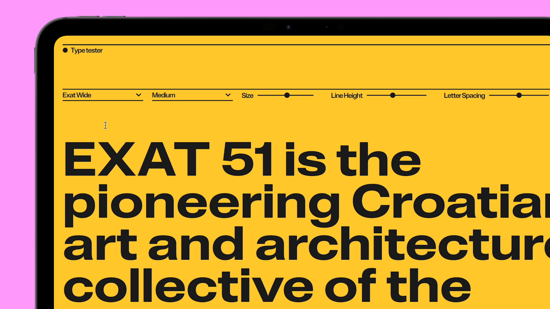
Typography vs font: let's stop mixing everything up
Before we go any further, let's set the record straight. No, typography and font are not the same thing. And if you're still confusing them, we better understand why your website looks like crap.
Last week, we audited an e-commerce site that was hemorrhaging customers. The owner had invested in "beautiful fonts" but completely ignored how to use them. The result? Microscopic text on mobile and paragraphs impossible to read. Beautiful font, sure. Catastrophic typography.
The font (or typeface) is the outfit your letters wear. Helvetica, Roboto, Times New Roman... It's the file you install. The tool. The raw material.
Typography is the art and technique of arranging these fonts. It's the science of readability, hierarchy, spacing, rhythm. It's the global strategy that brings your words to life.
Confusing the two is like confusing flour and pastry. Or bricks and architecture. Yes, choosing a beautiful font is important. But it's only the beginning of the story.
Typography is like your website's underwear.
Nobody talks about it. Everyone pretends it's not important. But when it's poorly chosen, it hurts your eyes and ruins the entire experience.
So let's cut the bullshit. Typography isn't just "a detail." It's the most omnipresent element of your site. It's literally everywhere. And yet, it's often the most half-assed consideration in a web project.
.webp)
The web's dirty secret: nobody reads your text in full
The painful truth? People don't read. They scan. They skim. They pick at it.
We've conducted eye-tracking tests on over 50 sites. The result is clear-cut: the majority of users only read 20 to 28% of a page's content. And you know what determines whether they'll stop to read an entire paragraph?
Typography. Not the content. Not your revolutionary product. Not your innovative concept.
The. F***ing. Typography.
"Typography is the art and technique of making human language visible. Good typography reflects the design's intention and serves the content. When poorly executed, it actively interferes with the reader's ability to understand what they're reading."
Ellen Lupton, curator at Cooper Hewitt, Smithsonian Design Museum & author of "Thinking with Type"
Three Truths Nobody Dares Tell You
.webp)
1. Your Default Font Screams "Amateur"
Using Times New Roman or Arial everywhere on your site is like wearing a plain white t-shirt to a gala. It gets the job done, but it screams "I made zero effort."
One of our clients had a site entirely in Arial. A tech innovation company with typography more generic than medication leaflets. We changed only the typography—nothing else. Conversion rates increased by 18%. Coincidence? Absolutely not.
Every font tells a story. Whether you want it to or not. And this story seeps into visitors' perception of your brand.
Arial? "We don't give a damn."Times New Roman? "We're stuck in 1998."Comic Sans? "We're a daycare center."
Your font choice speaks before your words are even read. But beware: a beautiful font poorly used is still a typographical failure.
2. Your Typographic Hierarchy Is Nonexistent
Sure, you have titles bigger than your paragraphs. Congratulations, you've reached kindergarten level of typographic hierarchy.
A real hierarchy is a coherent system that guides the visitor's eye exactly where you want it to go. That tells them what's important, what's secondary, what deserves their immediate attention.
Without clear hierarchy, your content is just a shapeless mass of words that nobody wants to untangle.
This is where typography (not just the font) comes into play: line-height, column width, margins, contrast. All these elements form a system that makes information digestible—or not.
3. Your Site Is Unreadable on Mobile
"But it's responsive!"
Great. And yet, nobody can read your content without zooming or squinting.
We have a ritual at Studio Namma: test every site on the team's oldest phone (currently an iPhone 8 with a slightly cracked screen). If it passes this test, it'll pass everywhere.
Mobile readability isn't an option. It's a vital necessity. 63% of web traffic comes from mobile. And guess what? On a small screen, typography becomes even more critical.
Too small? Unreadable.Too big? Ridiculous.Bad spacing? Painful.
Typography Trends 2025: What's Coming and What Must Die

What's Exploding in 2025
Variable Fonts Enter the Big League
If you're not using variable fonts yet, you're officially outdated.
These fonts are typographical Swiss Army knives: a single file contains thousands of variations in weight, width, and angle. Result? Smooth typographic animations, improved performance, and unprecedented expressiveness.
Google Fonts now offers over 200 quality variable fonts. And big names like Monotype have transformed their classics into variable versions. You have no excuse left.
Kinetic Typography Becomes Standard
Static sites are over. In 2025, your typography must move.
No need for crazy TikTok-style transformations. Subtle micro-animations on titles, elegant transitions between sections, typographic parallax effects.
We tested two strictly identical versions of a landing page—one with static typography, another with subtle animations on titles. Animated version: +22% time spent on page, +15% conversion rate. The numbers speak for themselves.
Typography in motion is no longer a luxury. It's an expectation. And sites that remain static simply look dead.
The Return of Super-Contrasts
After years of bland minimalism, the pendulum swings toward boldness.
Extreme contrasts are everywhere: ultra-thin fonts coupled with monumental bolds. Elegant serifs juxtaposed with brutal sans-serifs. Microscopic sizes facing gigantic titles.
It's a trend that will separate the brave from the timid. And in 2025, the timid won't make a buzz.
Accessibility Becomes (Finally) Sexy
Plot twist: accessibility is no longer that annoying constraint nobody wants to deal with.
We've long treated accessibility as a checkbox for government projects. What a mistake! By making a site more accessible for people with disabilities, we make it better for ALL users. We've seen this project after project.
Forward-thinking brands are making accessible typography their selling point. Generous spacing, optimal contrast, adaptive sizes.
Fonts specially designed for dyslexia like Atkinson Hyperlegible and Lexie Readable are becoming mainstream. And sites that don't follow suit instantly appear careless and outdated.
"The goal of typography is to reveal the character and content of a text. When readers are interested in meaning, they don't notice the medium. Good typography is invisible, bad typography is everywhere."
Jost Hochuli, Swiss designer and author of "Detail in Typography"
Typographic Systems as Identity Elements
In 2025, typographic systems become as recognizable as logos.
Take Netflix and its custom Netflix Sans font. Or Airbnb and Kellogg's. These brands understood that distinctive typography is as powerful as a logo. That's why we now push our clients toward complete typographic systems rather than simple font choices.
Companies are investing in proprietary typographic systems—not just custom fonts, but complete sets of usage rules that define their brand as clearly as their colors.
Think of it as a typographic fingerprint. Unique, identifiable, impossible to copy without it being noticeable.
What Must Die Immediately
Ultra-Light Fonts on White Backgrounds
It was elegant in 2020. In 2025, it's just cruel to the eyes.
We spent hours convincing a client to abandon their ultra-thin font on white background. He found it "elegant." We had him test his site with his 65-year-old mother. She couldn't read a word. End of story.
These skeletal fonts are unreadable on high-DPI screens and completely invisible to a significant portion of your audience.
If your font disappears when you squint a little, it has no business on your site. Period.
Lorem Ipsum in Mockups
Content and typography are inseparable. Designing with fake text is like choosing shoes without knowing the foot size.
AI tools generate realistic content in two clicks. Using Lorem Ipsum today is publicly admitting your laziness.
Overloaded Webfont Libraries
Loading 15 variants of a font to use only 3? Your users will not thank you.
Performance audits heavily penalize this amateur practice. And so does Google.
In 2025, typographic optimization is no longer optional. It's an SEO ranking criterion that can make the difference between first page and digital oblivion.
Obsession with the Latest Trendy Font
Using the font everyone uses is like wearing the same suit as all other guests at a wedding.
Inter replaced Roboto which replaced Open Sans which replaced... you get the picture. We're guilty of following trends too. But we're increasingly trying to explore lesser-known but equally quality alternatives.
In 2025, authenticity trumps trends. A lesser-known font perfectly aligned with your brand is worth more than the latest overused novelty.
And don't forget: successful typography must survive trends. If your typographic system needs complete revision every year, you've failed.
How Not to Screw Up (The No-Bullshit Guide)
Invest Seriously in a Typographic Strategy
Typography isn't a detail to sort out in 5 minutes.
Our typographic creation process typically takes an entire week. Yes, a week. To "just choose fonts." Because it's not just choosing fonts, it's building a complete communication system.
A real typographic strategy defines:
- A primary and secondary font (rarely more)
- A consistent typographic scale (not randomly)
- Systematic spacing rules
- Alternatives for each platform
- Fallback plans when fonts don't load
It's a system, not an isolated decision.
Test on Real Devices, with Real Eyes
Simulations aren't enough. Your typography must be tested on:
- Screens of different sizes and resolutions
- Various browsers (yes, even Edge)
- Diverse lighting conditions
- Users of different ages (50-year-old eyes aren't 25-year-old eyes)
We keep a "Device lab" in our office: old phones, ancient tablets, low-end screens... Everything that could break your design. If it passes on these relics, it'll pass everywhere.
Mobile display simulation on your 27" iMac is a comfortable lie.
Stop Blindly Following Trends
Yes, we just told you about 2025 trends. No, you shouldn't adopt them all.
The best typography is the one that serves your brand and your audience, not the one that looks pretty in your portfolio.
"Typography is to writing what voice is to speech. Good typography is invisible in the same way that good diction is transparent—it doesn't distract from the message but supports it and gives it authority."
Robert Bringhurst, author of "The Elements of Typographic Style"
Think Performance from the Start
Every font variant is a file to download. Every weight is a request. Every style is a cost.
Successful typography in 2025 is also optimized typography. Character subsetting, compression, lazy loading are no longer optional.
Fast sites convert better. And nothing slows down a site like poorly optimized fonts.
The Uncomfortable Truth

Perfect typography won't save a mediocre product. But mediocre typography can absolutely sabotage an exceptional product.
Is it unfair? Maybe. Is it reality? Absolutely.
So stop treating your typography like that task you delegate to the intern. Give it the attention it deserves.
Because in a digital world saturated with information, the way your words are dressed determines whether they'll be read or ignored.
Your design can be brilliant. Your UX can be impeccable. But if your typography is sh*t, everything else is too. It's that simple.
Related articles


Work with us if average isn’t your thing.
Drop it, we'll build it!